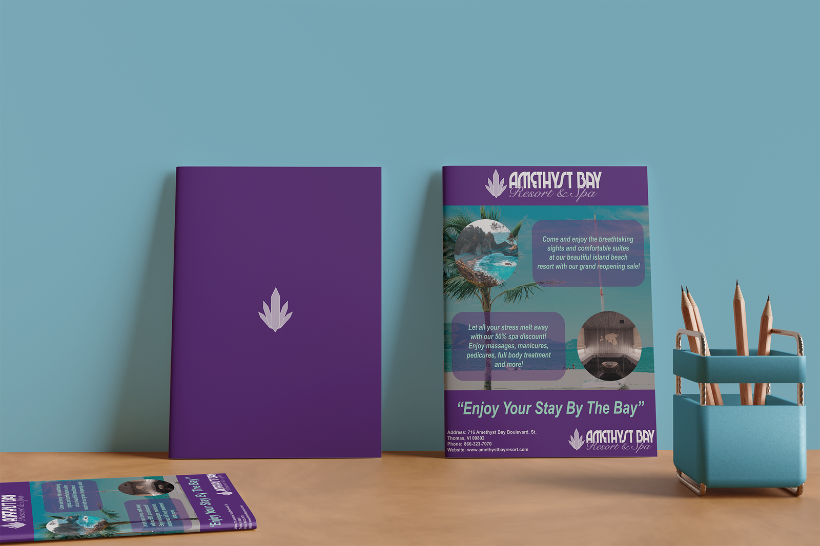
Amethyst Bay Magazine Ad
Program Used: Adobe Illustrator
The client for this piece was Amethyst Bay Resort & Spa and was made with the purpose to create an eye-catching magazine ad to help promote the reopening of a new spa location. When designing this piece, I wanted to focus on using the teal and purple colors from the client's provided style guide (as well as given typography) to help bring out key elements of the ad, such as using the teal color to make the tag line and the primary text detailing the grand reopening sale to pop out to the viewer as well as using the purple color to tie in the brand's logo for the header and footer of the magazine ad. Alongside this, I also decided to use an alternate version of the client's logo (that was provided within the style guide) to help fit in well with the purple elements and add balance to the piece. Lastly, I decided to create a backside for the page that utilized the brand's signature purple with the Amethyst Bay logo centered in the middle to help tie the piece altogether.